> For the complete documentation index, see [llms.txt](https://documentation.botghost.com/llms.txt). Markdown versions of documentation pages are available by appending `.md` to page URLs; this page is available as [Markdown](https://documentation.botghost.com/custom-commands-and-events/actions/message-actions/send-or-edit-a-message/layout.md).
# Layout
Layout components allow you to adjust the layout of a Components V2 message. There are four types of layout components:
| Component | Description |
| ------------------------- | -------------------------------------------- |
| [Container](#container) | Root container for components. |
| [Section](#section) | Text with required accessory (button/image). |
| [Separator](#separator) | Visual divider between content. |
| [Action row](#action-row) | Container for buttons (max 5) |
***
## Container
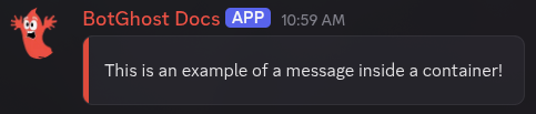
Containers can be used to create a container around a collection of components. They can optionally have an accent color set or be a spoiler.
### Accent Color
Optionally enter the hex color of the accent bar. Any variables that return a hex color can be used here.
### Spoiler
If this value is set to `true`, the container will appear as a spoiler (blurred out). Defaults to false. Variables can be used here.
***
## Section
A section is a component that allows you to contextually associate up to three text components with either an thumbnail image or a button.
***
## Separator
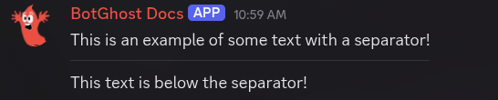
Separators can be used to visually separate two components with vertical padding and an optional divider line.
### Spacing Size
Separators can have either small or large spacing size. Set this to `SMALL` to create a compact visual break. Set it to `LARGE` to create a more prominent divider. Variables that return either `SMALL` or `LARGE` can be used here. Defaults to small spacing.
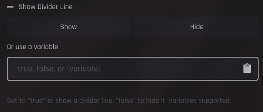
### Show Divider Line
Set this to `true` to create a small divider line in between sections. Variables that return either `true` or `false` can be used here. Defaults to false.
***
## Action Row
Action rows are containers for components and can contain up to five buttons or a single select menu. A maximum of five can be present in a single message.